Dear Moderator,

Welcome to my media blog, I have created a music magazine for my coursework. I hope you enjoy looking through my posts.

My Research and Planning start from Monday the 10th of September 2012.
And my Evaluation starts from Tuesday the 19th of February 2013.
Below you will find my completed magazine.

Thanks,
Amy Jenkinson

Thursday 27 September 2012

Research and Planning: College Magazine Evaluation


College Magazine Evaluation


Are the font sizes correct? 
On the cover the text is just the right size as you are able to see the cover lines clearly. The mast head is big and bold so the name of the magazine is clear and the audience will be able to identify the magazine. I have chosen to make the colleges website and the issue number a small font as these are the least important. On the contents page the word 'contents' is in a big font size so it stands out and the audience knows straight way it is the contents page, also the articles have been made clear so the audience knows which page they will find the article they want to read.

Does it follow the three colour rule?
My college magazine uses the same colour scheme throughout the magazine, It follows the three colour rule as I have used green, pink and blue. The colours I used was the colours I had chosen to use when I created my draft. Also I have included a black background so the images and text will stand out.

Can you tell that the cover and contents page are from the same magazine?
I can tell the cover and contents page is from the same magazine because of the colour scheme I used continues from one page to the next. Also the style of font is the same on each page.

Are the photographs well taken and appropriate?
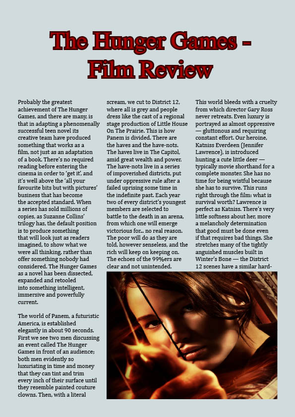
I think that the quality of the photographs I used could of been better, so if I was to make this magazine again this is one thing I would improve. The image on the cover is a medium close up and is in the center so it is the first thing you see, also it is slightly overlapping the mast head.

Are there enough stories on the cover and on the contents page, and are they appropriate?
When creating the magazine I took the advice from the audience interviews, this helped me decide what kind of articles to publish. Students said they would like to read about whats happening around college, reviews on music (which will be included in the student reviews) and the latest trends. I had chosen to use these specific articles on the cover to try and attract the target audience. I think I could of added more articles to the contents page as the bottom of the page is blank.

Research and Planning: College Magazine Contents Page


Research and Planning: College Magazine Cover


Research and Planning: College Magazine Photos


Research and Planning: College Magazine Original Photos

My Magazine cover and contents page both include original photography, I took a number of photos before I chose the photo I wanted to use for the cover. Here are the photos I have taken;


Thursday 20 September 2012

Research and Planning: College magazine so far

 Research and Planning: My College magazine so far

This is my college magazine so far, I have created the mast head and a background, I have placed a bar code and started to create the cover lines.

I  have used dafont.com to find font which I thought was appropriate for a college magazine. My colour scheme is going to green, pink and blue.

Research and Planning: Font Activity

Research and Planning: Font Activity


I experimented with different fonts and colours and chose the fonts which I thought was appropriate for the word. I looked at the website dafont.com for different styles of font, after I had chosen the font that I liked I changed the colour and added strokes and back shadows.

Research and Planning: Audience Interview Video

Interview 1
  • Wants to read music reviews.
  • Bright, likes blue.
  • Good layout, doesn't need changing.
  • 50p, for cost of production.
  • Looks retro, names good.
Interview 2
  • News about whats going on round college, cinema listings, latest trends.
  • Bright, they go together, green is in the Hyde Clarendon logo as well.
  • Likes how bits are at different angles so it catches your eyes and likes how the main story is straight so its the first thing you see.
  • 30p/40p because she doesn't have a lot of spare change and would pay it to cover the cost of making it.
  • Likes the mast head because its the first thing you see and it stands out and likes the name, more likely to pick it up because it has the colleges name on.
Interview 3 
  • Things that are going on around college.
  • Bright, easy on the eye, works well.
  • Good layout, add one or two more articles.
  • Yes but it depends on what articles maybe competitions, up to a £1.
  • Suits the college because its Hyde Clarendon.


Monday 17 September 2012

Research and Planning: Audience Interview Questions

Interview Questions

1. What kind of stories do you want to read about in a college magazine?

2. What do you think of the colour scheme?

3. What do you think of the layout? How would you change it to improve it?

4. Would you pay for a college magazine? Why? And if so how much?

5. What do you think of the mast head? (Do you think it looks appropirate?) (what do you think of the name?)
 

Thursday 13 September 2012

Research and Planning: Medium close-up shots examples

 Research and Planning: Medium close-up shots examples

Here I have collected some  examples of medium close-up shots, therefore I understand what a medium close-up is and I intend to use this type of shot for my main image when I create my magazine.

Research and Planning: College Magazine Analysis

Research and Planning: College Magazine Analysis

Without reading this magazine you can automatically tell that the target audience is college students.

The masthead of the magazine says 'college' at the top of the page which tells us this is a college magazine, also it is big lettering and the colour is bright to catch the readers attention.

The main image used for the front cover is a medium close-up shot of a young man carrying books which say 'law, business and society' on the cover this makes me assume the man is a student, the image is centred in the middle of the cover and has been brought to the front of the mast head so the model is the centre focus.

Also the sell line and cover lines all suggest the magazine is aimed at 18-21 year old students as the language used on the cover is modern and one of the cover lines says 'kingstons hottest night spot', this is aimed at a stereotypical student who likes to go out and have fun and relax. Also it mentions 'make money on campus' this article is aimed at students as most students are looking for part-time jobs to earn extra money while they study and it says they can make money on campus which is where they live. The magazine includes a bar code and the issue number and date. The colours also suggest that its for students as its bright and fun which reflect the stereotype of a student.

Research and Planning: Indesign

Research and Planning: Indesign

Today I have used indesign for the first time and created a film review page for the film Hunger Games.

1. Firstly I added columns to help guide me by clicking on layout then create guides.

2. Then I added the text by going to file then clicking on place and selecting my text, I used the columns to guide me to fit the text. The text didn't fit in the column so I had to continue the text by using the red square that comes up at the bottom of the text box and dragging it to the next column.

3. Next I added a image by going to file then clicking place and selected the image. the image did not fit the frame so I went to object then fitting and clicked on fit content and frame. 

4. Next I wanted to add a headline so I used the text box tool, and then changed the size of the text and changed the colour to red by clicking on colour. Then I added a stroke by clicking on stroke and changing the weight and colour. 

5. Finally I added the blue background to the page, but it covered all over the text and the image so I went to object and clicked on arrange and clicked send to the back.

Wednesday 12 September 2012

Research and Planning: Film Poster

Film Poster

I edited the original film poster for pirates of the Caribbean 4, so that the actress Mila Kunis would replace the face of Penelope Cruz. I did this by using the magnetic lasso tool to cut out the face of Mila Kunis from the picture to move it to the film poster.

After I did this i experimented with colours and changed the exposure and brightness of the image.

Tuesday 11 September 2012

Research and Planning: Photoshop Challenge

Research and Planning: Photoshop Challenge

1. Firstly I added text by clicking on the text tool and wrote 'AS Media Studies' in Century Gothic style in size 24. Then changed the colour to red.

2. Next I changed the background to blue.

3. Then I added a picture from the internet and changed the colour of his hair by using the brush tool and experiemented with the colour and opacity.

4. I added a border by using the brush tool and changed the size of the brush and the colour to pink and drew around the image.

Research and Planning: Skin Tutorial

Research and planning: Skin Tutorial

 Before;
1. Firstly I started by using the healing brush tool to hide the blemishes. I changed the size of the brush to smaller to adjust to the same size of the blemishes.

2. Next I added a another layer by going the layer then clicking duplicate layer, I then clicked on the copy and then went to filter and then blur then changed the opacity to 45%. 

3. I changed the colour of her hair by using the brush tool and experimented with different colours and the opacity.
After;

4. Then I added lipstick stick, also whitened the teeth, added eyelashes and blusher using the brush tool.

Monday 10 September 2012

Research and planning: Photoshop CD tutorial

Research and Planning: Photoshop CD Tutorial

First I opened all of the images with Photoshop which I needed. Then used the Elliptical Marquee tool to crop the CD image then moved it to my background image. I re-sized the image and rotated it, after that i selected the CD image and changed the colour by clicking on Image then adjustments then colour balance.

I then had to crop the horn image so i used the magic wand tool and selected then white background then I went to select then clicked on  similar, it then selected all of the white bits, I then clicked on select and inverse so then the horn was selected. I moved then image to the background and changed the colour using colour balance again and re-sized the image.

I then went to windows and added the layers pallet then clicked on the music notes to bring them to the front then changed the colour again using colour balance.

I added the text by using the type tool and changed then colour and then added a shadow drop then finally I changed the background by going to filter then distort then went to wave then changed the wavelength.