Here is the video for my audience interview.
 |
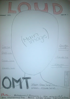
| Draft 2 |
 |
| Draft 1 |
Interview 1:
- Up to £4 because she has a bit of spending money but wouldn't want to spend too much.
- Yes it looks cool and likes to bands mentioned, and looks indie.
- Really likes it and the name and suits a music magazine its similar to other magazines from the same genre.
- Red and black goes together, red vibrant and stands out.
- Likes main image on draft 1 and likes the layout of cover lines on 2nd.
- New bands, Q and A sessions with artists, interviews to find out more.
Interview 2:
- £2 or £3, same region of other magazines.
- Yes, includes bands he likes, looks indie/rock.
- Likes it, suitable as some of the bands are loud.
- Suitable, eye catching, not boring.
- Draft 1, because the 2nd is boring.
- Upcoming gigs, new albums coming out, band fact files.
Interview 3:
- Up to £3 to £4 as long as it includes what he want to read about.
- Yes because its music he is in to, alternative/rock.
- Likes it, its very appropriate.
- Very good, same colours he was suggested for his magazine as its the same genre.
- Draft 2, because of the main image shot type and the layout.
- Gigs, festivals, competitions, about the bands, because it interests him.
No comments:
Post a Comment