Dear Moderator,

Welcome to my media blog, I have created a music magazine for my coursework. I hope you enjoy looking through my posts.

My Research and Planning start from Monday the 10th of September 2012.
And my Evaluation starts from Tuesday the 19th of February 2013.
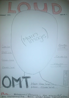
Below you will find my completed magazine.

Thanks,
Amy Jenkinson

Thursday, 25 October 2012

Research and Planning: SLR test shots

Today I have used a SLR camera and took some test shots at various locations. We first went to Hyde Park, I have considered this location as a possibility for my own photo shoot, also I took some in and around college. The photos were taken using the different settings and the flash on the camera.


This shot is a medium long shot and was taken outside and i think it is a bad shot as the lightening is quite bad as the tree is blocking the natural light, therefore the photo is dark.

When taking the photo the camera was not focused and when I looked at the photo on the computer the photo appeared a little blurry when you look at it closely.


This shot is a extreme close up. For this shot I have used the macro setting, this helps show lots of detail on small objects and blurs the background. I think this photo is good as it has lots of detail of the leaf.
                                                                                   
This shot is a good establishing shot of Hyde Park, it is well lit from natural light.

This shot is an extreme close-up, as this photo was taken indoors the flash was used and the macro setting. I think this is a good image as it is very detailed

This shot was taken inside, the photo appears to be a shade of yellow because of the surrounding light of the model, I could of used flash so this would not have happened.

This shot is a close up and like the photo above it appears yellow. I could of used the macro setting and flash therefore this wouldn't have happen and the image would be more detailed.


This shot is a long shot, I think this is a good image as it is well lit because of the natural light. As the photo had good natural lightening I did not used flash as there was no need to.


This is a bad shot as there is a object in front of the camera lens therefore is blocking the view. Also the image behind the object appears to be dark.


This shot is an extreme close up of a lock. This shot was taken outside and I used the macro setting, so this helped show more detail on the photo.


From taking these test shots I now know what settings to use when I take my shots for my magazine, also i know what setting to use depending on the location (e.g. outside, indoors). Also it has given me ideas for my location for my own photo shoot.

Tuesday, 23 October 2012

Research and Planning: What I have done today

Today I have drawn my draft for my double page spread, I have uploaded it to the post Research and Planning: Music magazine drafts. Now I have finished creating my draft I now will look back at my audience feedback from peers and see if my drafts are suitable, I will make changes then I will redraft them and upload them to my blog.

Monday, 22 October 2012

Research and Planning: Equipment List

Here is the list of equipment I will be using in the process of creating my music magazine:

  • SLR camera


  • iMac/ Mini Mac


  • Lighting


  • Backdrop


Research and Planning: Props List

Here is a list of the props I will need for my photoshoot:
  • Acoutic Guitar


  • Chair (If set indoors)


  • Bench (If set outdoors)


Research and Planning: Costume list


I looked at different artists from the genre indie/rock and collected images to help me decide on the appropriate costume for my model. My artists included in my magazine will be a mixture from the two genres, however will include more artists from the indie genre. I will need a number of different outfits for the different photos I am going to take.

Male Model:


               Ideas
  • Sunglasses
  • Jeans
  • Leather jacket or demin jacket
  • T shirt or Shirt
  • Scarf

Female Model:


              Ideas
  • Leather jacket
  • Printed t-shirt
  • Blouse
  • Printed legging
  • Wet look trousers
  • Glasses
  • Hat
  • Bracelets/necklaces ect


Friday, 19 October 2012

Research and Planning: Software List


In the process of creating my music magazine i will use the following equipment and software:
  • Adobe Photoshop


  • Adobe Indesign


  • iPhotos

  • Firefox

  • Blogger


Research and Planning: Production Schedule

Here is my production schedule which shows you what work I intend to complete in the following week. If I follow the schedule I am guaranteed to complete my work before the deadline.


Research and Planning: Audience Interview Video

Here is the video for my audience interview.


Draft 2

Draft 1


Interview 1: 
  1. Up to £4 because she has a bit of spending money but wouldn't want to spend too much.
  2. Yes it looks cool and likes to bands mentioned, and looks indie.
  3. Really likes it and the name and suits a music magazine its similar to other magazines from the same genre.
  4. Red and black goes together, red vibrant and stands out.
  5. Likes main image on draft 1 and likes the layout of cover lines on 2nd.
  6. New bands, Q and A sessions with artists, interviews to find out more.
Interview 2:
  1. £2 or £3, same region of other magazines.
  2. Yes, includes bands he likes, looks indie/rock.
  3. Likes it, suitable as some of the bands are loud.
  4. Suitable, eye catching, not boring.
  5. Draft 1, because the 2nd is boring.
  6. Upcoming gigs, new albums coming out, band fact files.
Interview 3:
  1. Up to £3 to £4 as long as it includes what he want to read about.
  2. Yes because its music he is in to, alternative/rock.
  3. Likes it, its very appropriate.
  4. Very good, same colours he was suggested for his magazine as its the same genre.
  5. Draft 2, because of the main image shot type and the layout.
  6. Gigs, festivals, competitions, about the bands, because it interests him.

Research and Planning: Audience Interview Questions

1.  How much would you pay for a music magazine? And why?

2. Would you buy this magazine? Why? And what genre do you think it is?

3. What do you think of the masthead? Is the name suitable and do you like it?

4. What do you think of the colour scheme? Do you think it is suitable?

5. Which cover do you prefer out of the two drafts? And why?

6. What would you like to read about in a music magazine? What articles? And why?

Thursday, 18 October 2012

Research and Planning: Podcast


This is a podcast which i made by using ishowu, this shows you what i have done on my blog so far.

Tuesday, 16 October 2012

Research and Planning: Questionnaire Results Slideshow


Here is a slideshow of my results I collected from my questionnaire. This research can help me when creating my music magazine.


Research and Planning: Questionnaire Questions


Questionnaire

1.    Are you male or female?

2.    How old are you?

3.    What genre of music do you listen to?

4.    On the cover do you think there should be a male or female model?

5.    Should there be a band or solo artist on the cover?

6.    What colours do you associate with the indie/rock genre?

7.    Do you read any music magazines if so which ones?

8.    What do you think of the name ‘Loud’ for a music magazine?

9.    What articles would you like to read?
           (Interviews, reviews, etc.)

Thursday, 11 October 2012

Research and Planning: Double page spread analysis


Double Page Spread Analysis

This is a double page spread from Q magazine. It features the band Beady Eye. The colours used are red, white and black, this follows the three colour rule; these colours are commonly used in this genre. The colour scheme also implies the target audience is males. Also this colour scheme has been continued throughout the magazine.

The main image used for the article is spread across the top half of the page, the shot used is a wide shot so the whole band fits onto the page. The band is Beady Eye, which was formed by the ex-oasis member Liam Gallagher - who is now the lead singer for Beady Eye. The band members are all sat on a couch, however Liam Gallagher is sat on a separate chair which appears closer to the camera therefore he looks bigger, this maybe because he is the frontman of the band and is more well known compared to the other members and could be seen as more important. Plus Liam Gallagher is slightly overlapping the title which could also suggests that he is the most important compared to the other members as there are three pugs - a piece of text that includes information about the three members - overlaps each of the other members, this text could imply that the readers don't know much about the other members are they aren't well known.

The title of the article is 'what eye once was', the word 'eye' has been interpurted into the title as its a spin-off of the band name, the word has been highlighted in red which complies with the colour scheme. The other words are in black which is againist a white blackground so its stands out and catches the attention of the reader.

It is clear that the article is a question and answer interview as the questions and the intiails of the band member answering the question are in a bold font compared the the answers so they stand out.At the start of the first paragraph a drop capital has been used, which is bold and black and stands out therefore it is clear to the reader where the artcile begins. The body text has been organised into six columns at the bottom of page.   


Research and Planning: Analysis of contents page

Analysis of contents page

This is the contents page for Q magazine it is quite basic and clear so that the readers can locate an article easily. The contents page is used to tell the audience what is included or who is featured in the magazine.

On the cover it followed the three colour rule of red, white and black which has been continued to the contents page and throughout the rest of the magazine, this implies that the magazine is of a indie/rock genre as these colours are associated with this genre. The colours used could also reflect the target audience which is males.

In the corner of the page it has the logo of the magazine brand which was included on the mast head on the cover, next to the logo it says 'contents' which makes it clear what page it is. The magazine has over 200 pages as it is a monthly magazine. By looking at the articles which are featured in the magazine suggests the target audiences is in their twenties.

The contents page includes two images; the main image is of the band The Courteeners who are featured in an article. The shot is a long shot at a low angle, this shot makes the band appear higher up which could represent their status and fame. In the background of the image their is dark clouds and the image seems quite serious which reflects the facial expressions of the band members as they seem serious which also implies the genre of the magazine and the band is indie/rock. The second image is centred at the bottom of the page, it is a smaller image as the article is smaller compared to the main image which is the main article. Both the images on the contents page is of males which could imply the target audience of the magazine is males.

I looked at another contents page from Q magazine and it shows that each month they follow the same layout as shown above.


Tuesday, 9 October 2012

Thursday, 4 October 2012

Research and Planning: Music Magazine Drafts

Here are the drafts for my music magazine cover, contents page and double page spread;
Cover idea 1
Cover idea 2

Contents


Double page spread

Tuesday, 2 October 2012

Research and Planning: Three masthead designs


I have been looking at the different fonts that I could use for my masthead on my own music magazine, I have still yet to decide the name of my magazine. The names I have chose underneath are examples I could use but still aren't sure. I experimented with different fonts on dafont.com to try and find a font which would reflect the genre of music in my magazine which is going to be indie/rock. I chose to use red, white and black as I have researched other magazines of the same genre and this colour scheme is what most of them follow.


- The name 'loud' came from looking out my collage and this word stood out.


- 'M magazine', simply stands for music magazine.


- The name 'adored' has come from the lyrics
of a Stone Roses song.

Research and Planning: Music Magazine Cover's Analysis


Research and Planning: Music magazine cover's analysis

I have chosen to analyse two magazines of the same genre I would like to use for my magazine.

The first magazine is Q magazine, which features Kasabian on the cover. The magazine has followed the three colour rule as it has red, white and black, this colour scheme is used on every magazine they publish so that the magazine is recognisable for the readers. The masthead has a red background and white text, these two colours are bold which highlights the brand name and also allows quick recognition. The main image on the cover is of the band Kasabian this suggests to the readers what genre the magazine is going to be, also the cover includes such bands as Arctic Monkeys and Blur, which implies to the reader that the magazine is of a rock/indie genre. The image is a long shot of two members of the band and shows the guitarist of the band holding a guitar which is on fire, which ties in with the cover line "The 101 Hottest things in music now", also the magazine was published in 2009 which is when Kasabian's single 'fire' was released, a line in the song is 'I'm on fire' which the magazine has decided to interpt into the cover as the main cover line says "Kasabain they're on fire". The sell line tells the readers that it the UKs biggest music magazine which suggests its the best magazine out there for this magazine genre so the readers will buy it.

The second magazine is NME, which features Lana Del Ray on the cover. The magazine also follows the three colour rule as it has red, white and blue, this colour scheme has been used to comply with the american flag because Lana Del Ray is an american artist who uses the american flag in all of her videos which suggests she is proud to be american, also it ties in with her single 'National Amthen', this could be why they have chosen to use an american flag in the background. The masthead is in a white bold font so it stands out from the background and allows it to be easily recognised. The main image is a midshot at eye level, her facial expression implies she is fun-loving and she describes herself as a 'psycho' on the cover lines. Other coverlines include artists or bands from an alternative/rock genre such as Nirvana, Noel Gallagher, Pete Doherty ect, which suggests the magazine is of an alternative/rock genre. Also the cover lines are slightly slanted in contrast to the Q magazine as Q's cover lines are straight but both magazines have their main cover line bold and in the centre of the page to attract the readers attention and imply who and what is featured in the magazine.


Research and Planning: Music Collage


I have been researching different genres of music magazines to help me decide on a genre, I made a collage of the music I like using different magazines such as Q and NME.

Research and Planning: Shot Types